
Project Type
User Research, Eye Tracking Study, Usability Testing
My Role
UX Researcher
Project Timeline
4 Months
Project Scope
Think-Aloud Protocol, SUS, Heuristic Evaluation
Software Used
Tobii Pro X2, Tobii Pro Lab, Adobe Premier, Figma
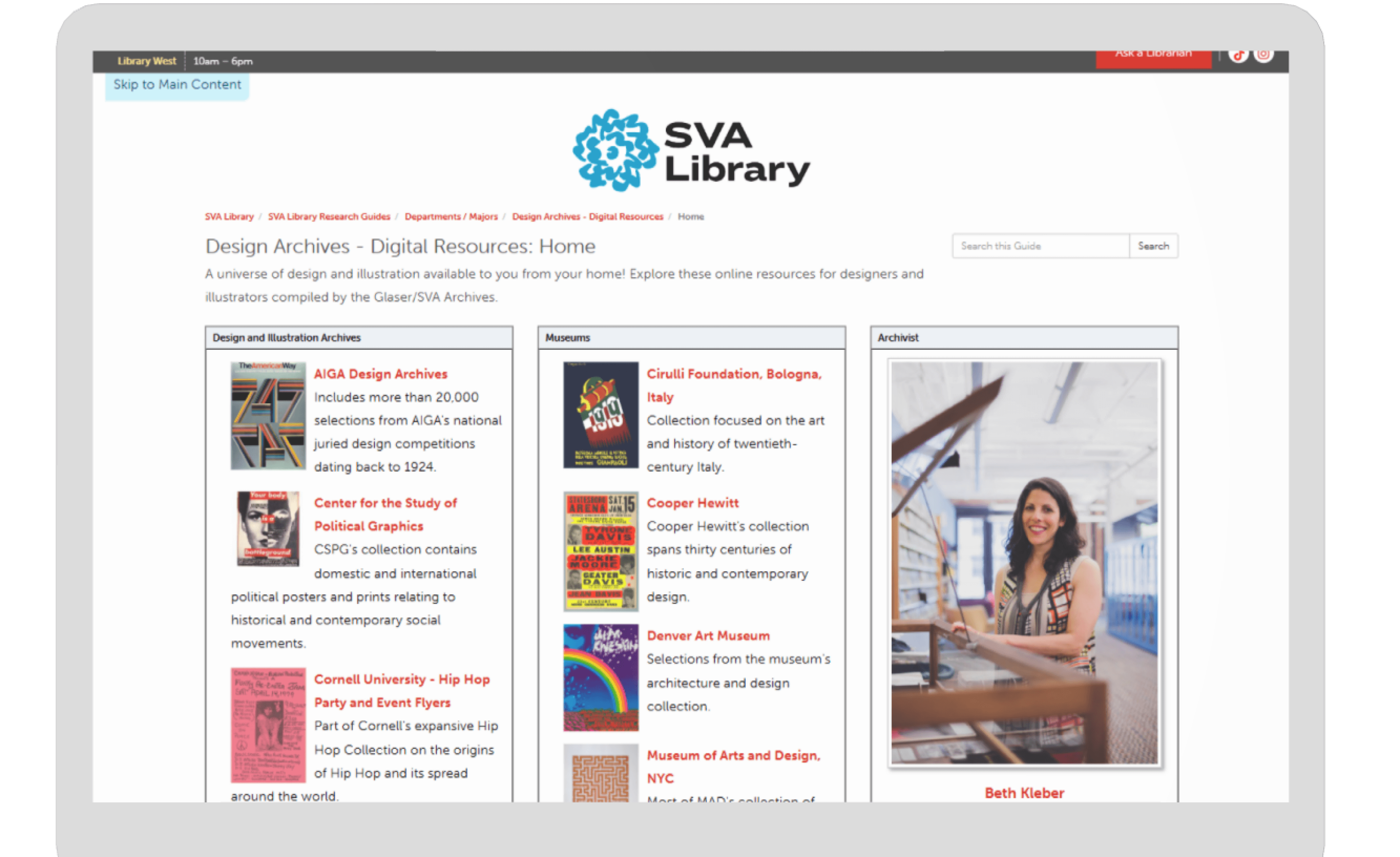
Eye-Tracking the Future: SVA’s Research Guides
The School of Visual Arts (SVA) is a art school with a wide array of online resources tools and archives aimed to supporting the needs of art and design students. However, user feedback indicated that these platforms despite being rich in content were difficult to navigate, lacked visual clarity, and didn't align with students' natural browsing behaviors.
To address this, our team was brought in to evaluate and enhance the usability of these digital tools through eye-tracking, usability testing and heuristic evaluation.
The key guiding question
How might we make it easier for students to find the right resources in research guides?
Three Pronged approach
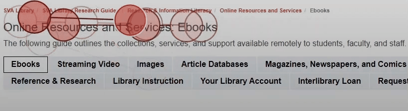
Eye-Tracking for Task Completion
System Usability Scale (SUS)

Deeper insights and inform solutioning.
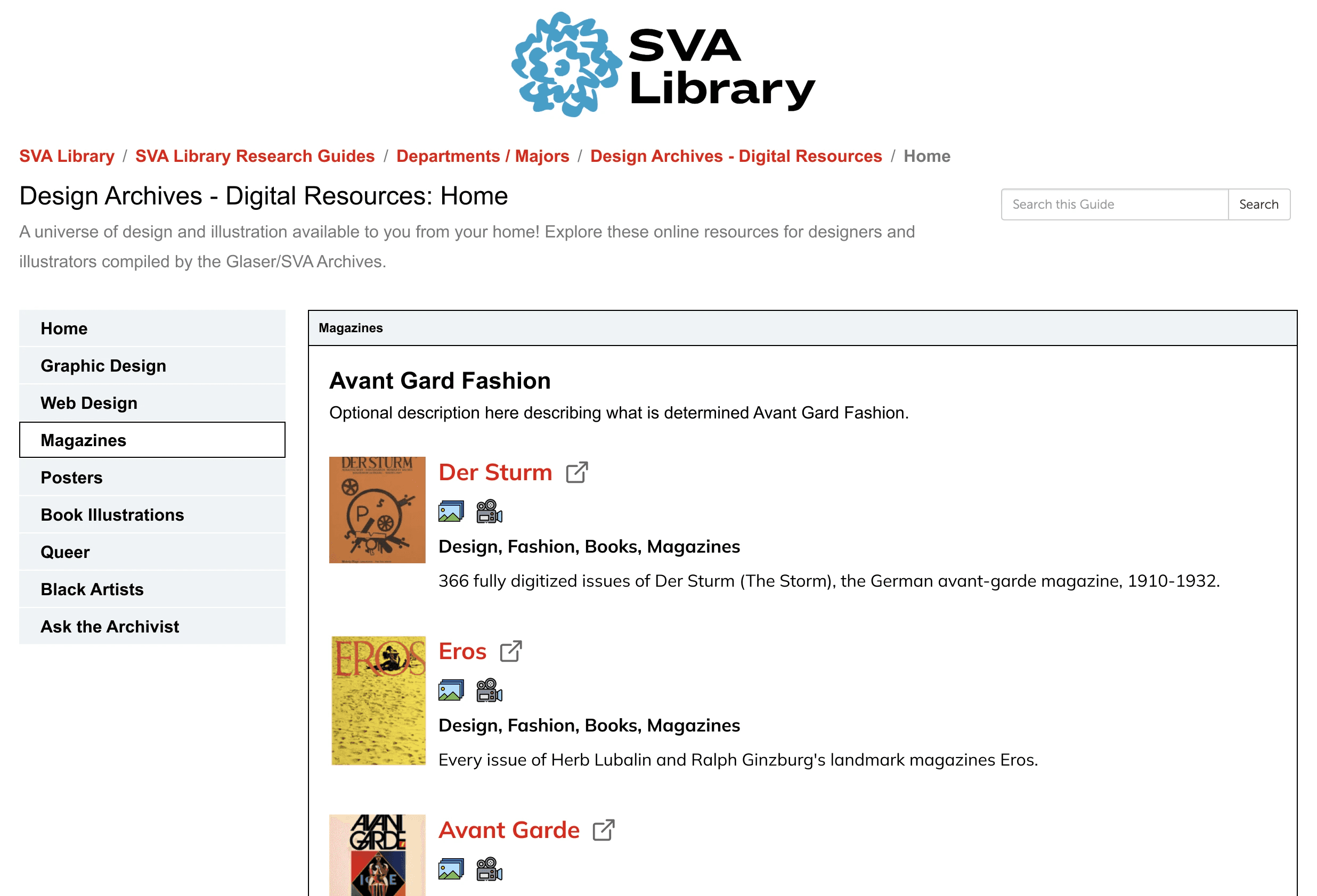
We tested these two sections to learn how students use them and find ways to improve the experience.
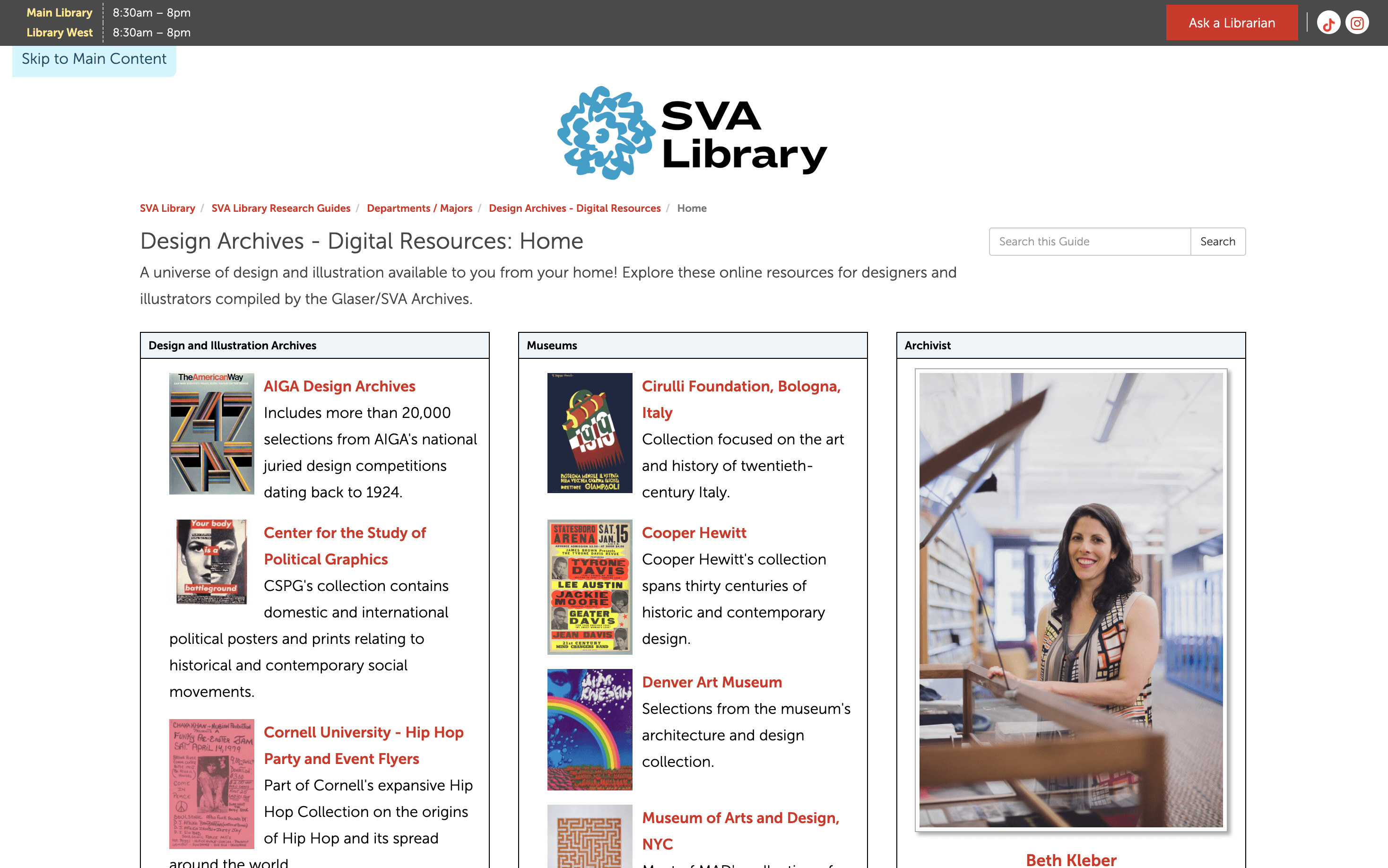
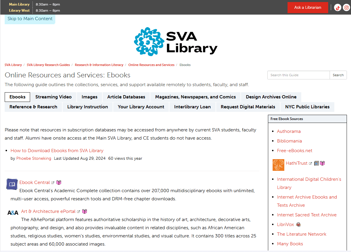
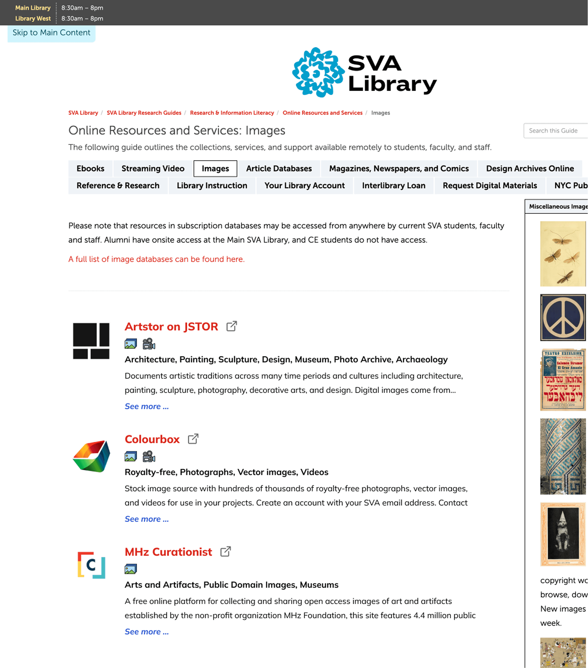
Online Resources
Design Archives
Online Resources
Target Particpants
Should be attending SVA or have used library websites for research purposes
Age
18 - 70
We developed two task - based usability session to observe how students interacted with the Research Guide pages in realistic scenarios.
Each task included eye-tracking and follow up interviews to understand what users did and why.
What We Asked and Why
For the Online Resources Page
Scenario
Imagine you are a student writing a paper on the history of American fashion.
Task
Find resources you could use to source fashion magazine photos to serve as the topic of your paper.
Scenario
Imagine you are a graphic design student designing a movie poster.
Task
Explore the page to find suitable typography resources for your project.
What Worked
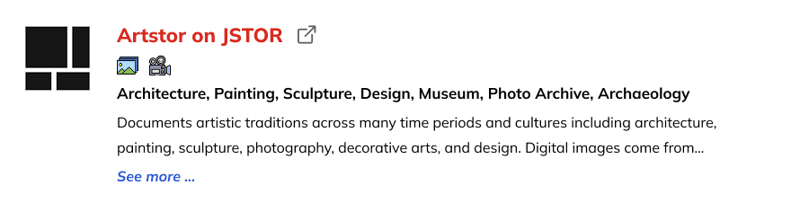
Finding the Relevant Resource
Participants successfully completed the task by finding relevant resources
83 %
Students used headings like “Magazines” and known publication titles to guide them.
Strong visual hierarchy and helpful images
of students identified keywords such as “font” and found at preview images helpful when locating their resources
75 %
“I saw the word ‘Typography’ and immediately knew where I’d go.” participant
-Desktop
Tabs and filters helped students narrow options.

Participants discovered and used the top navigation tabs on the Design Archives page to quickly focus their search.
The tab helped participants narrow down their options and find the relevant database.
Problem Findings in Online Resources

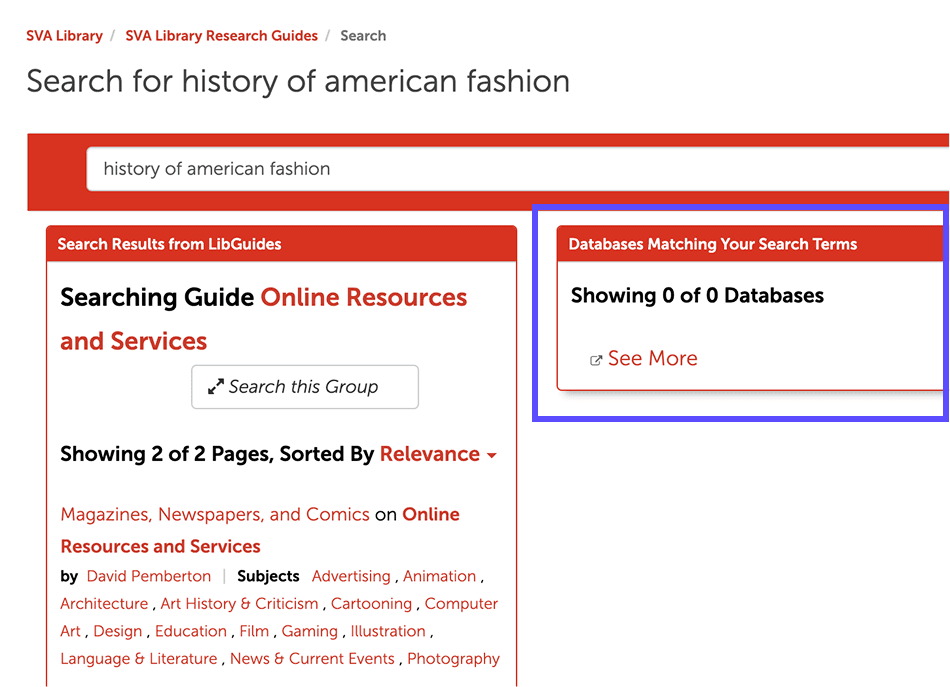
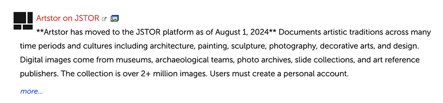
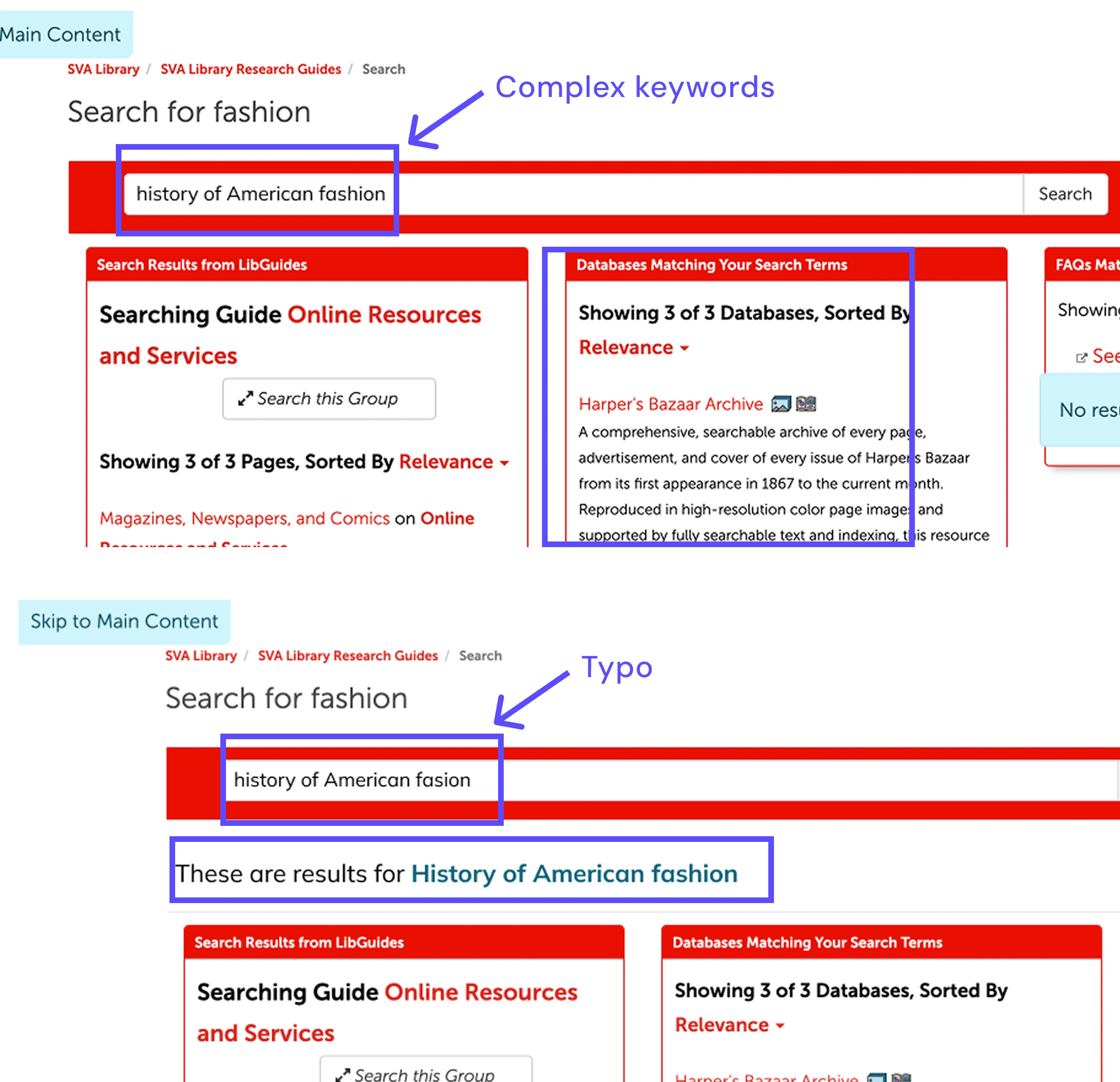
Problem 1: Despite preferring the search bar, some students still couldn't get a relevant database result using it.
Students try to search but the current search functionality does not meet their needs when the keyword is complex.
fashion
history of American fashion
Fashion Magazine photos
history of American fasion (Typo)
fashion magazine
Problem 2: Students struggles with information overload and had difficulty parsing the information, they tended to avoid reading the paragraphs
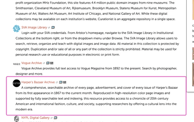
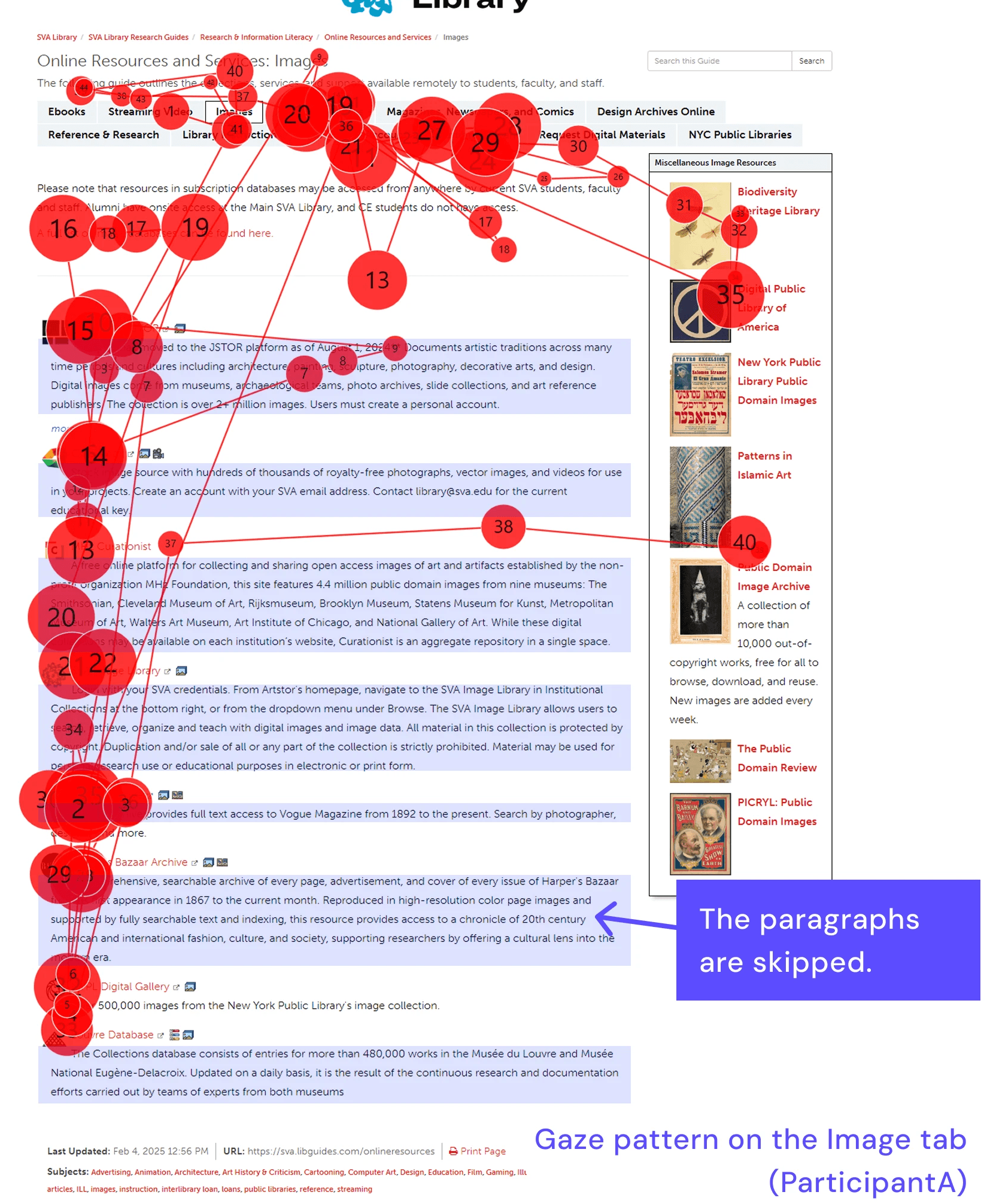
Instead of using the search bar, students attempted to skim the page, but the dense text and lack of information hierarchy made this difficult.
Mentioned information overload issue
67 %
Problem 3: 3-column structure causes long, unfocused scrolls. Increased cognitive load prevents users from focusing on and understanding individual items.
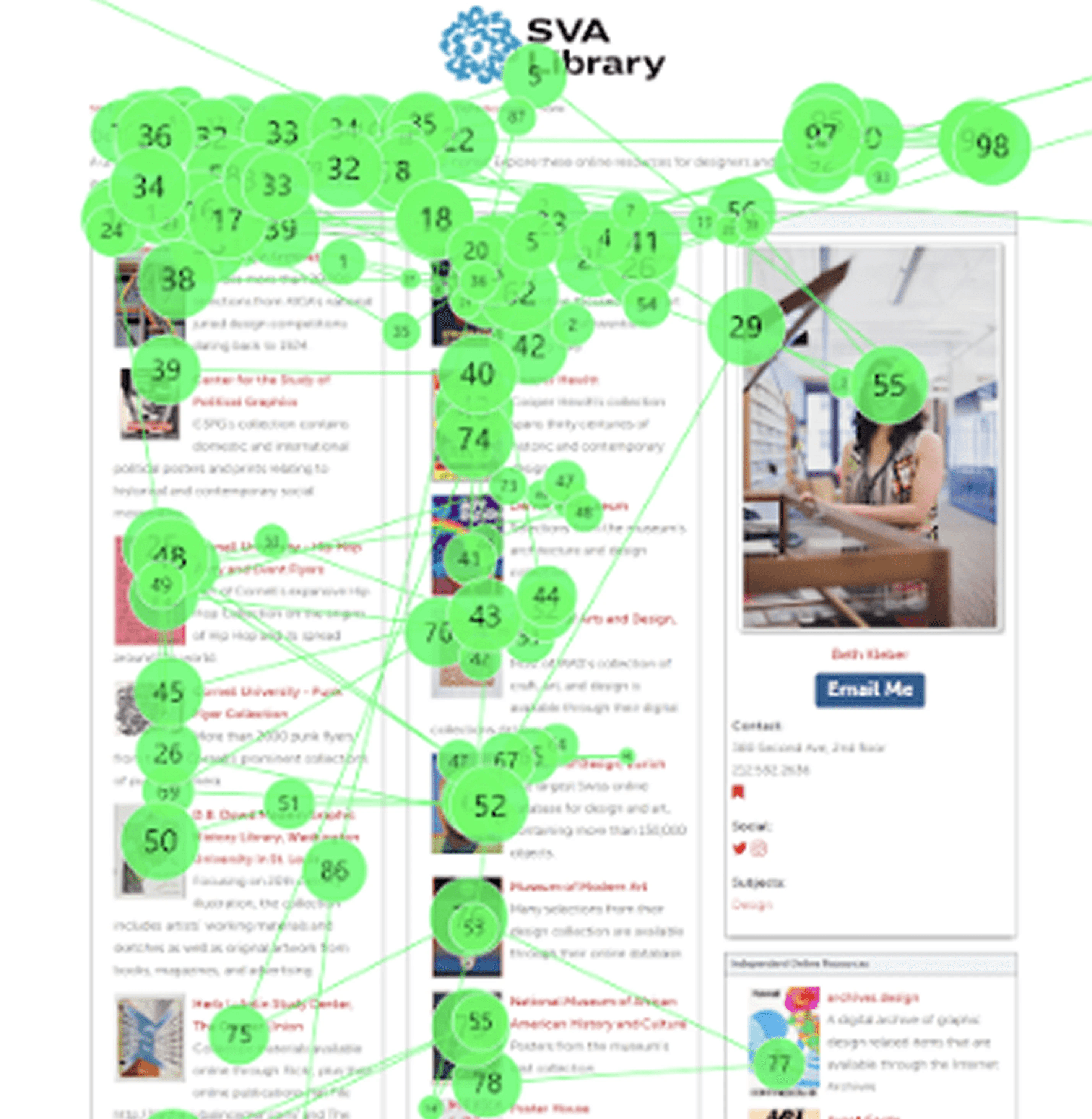
Participants weren’t sure whether to read top to bottom or left to right. Some missed entire sections. Resources in the third column and below the fold often go unnoticed
of participants scrolled from up and down multiple times before selecting a resource
66 %
Problem 4: Column labels are too small and vague to help users distinguish different categories
participants missed or did not find column labels helpful for going through the page
83.3 %
Recommendations
Solution 1
Before
After
As we found that many students felt overwhelmed by long blocks of text and had trouble figuring out which databases were useful to them. Most didn’t read everything—instead, they quickly scanned for anything that stood out. To address this, we recommend making the content easier to scan and understand at a glance:
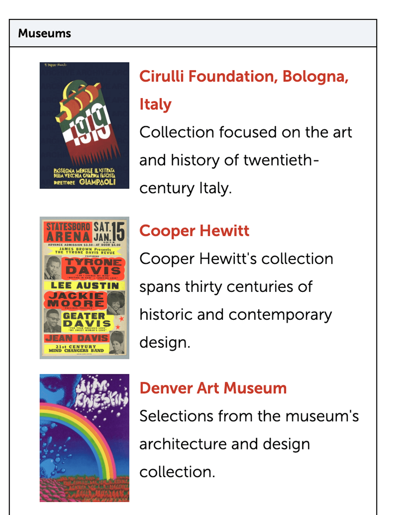
Make logos and icons larger so students can spot them more easily
Use bigger and bolder titles for each database to help students quickly identify what they’re looking at
Add short keywords or tags to explain what each resource is about
Shorten long paragraphs and keep descriptions brief
Include a “See more” option so students can choose when they want more details
Solution 2
To solve this, we recommend making the search function more flexible and accurate by:
Allowing for more complex search phrases (e.g., “history of American fashion”)
Automatically correcting typos and common spelling mistakes
Delivering results that match a wider range of keywords and topics
By improving the search experience, students will be able to find relevant databases more efficiently without relying solely on trial and error or scrolling through dense lists.
Solution 3
Grouping content to narrow the focus
Tabs help users filter content based on search intent. (No more sporadic search across columns).
Noticeable headings to improve navigability
Larger headings further group content and give users anchor points to help them navigate the page.
More Informative Archive Items Tell Users What They Should Expect to Find
Using icons and keyword tags helps students quickly understand what each resource offers and find relevant materials faster.